
Business Dashboard Design: KPIs, Data Sources and Governance
A practical business dashboard design guide for owners and teams who need trusted KPIs, clean data sources, useful reporting and governance.
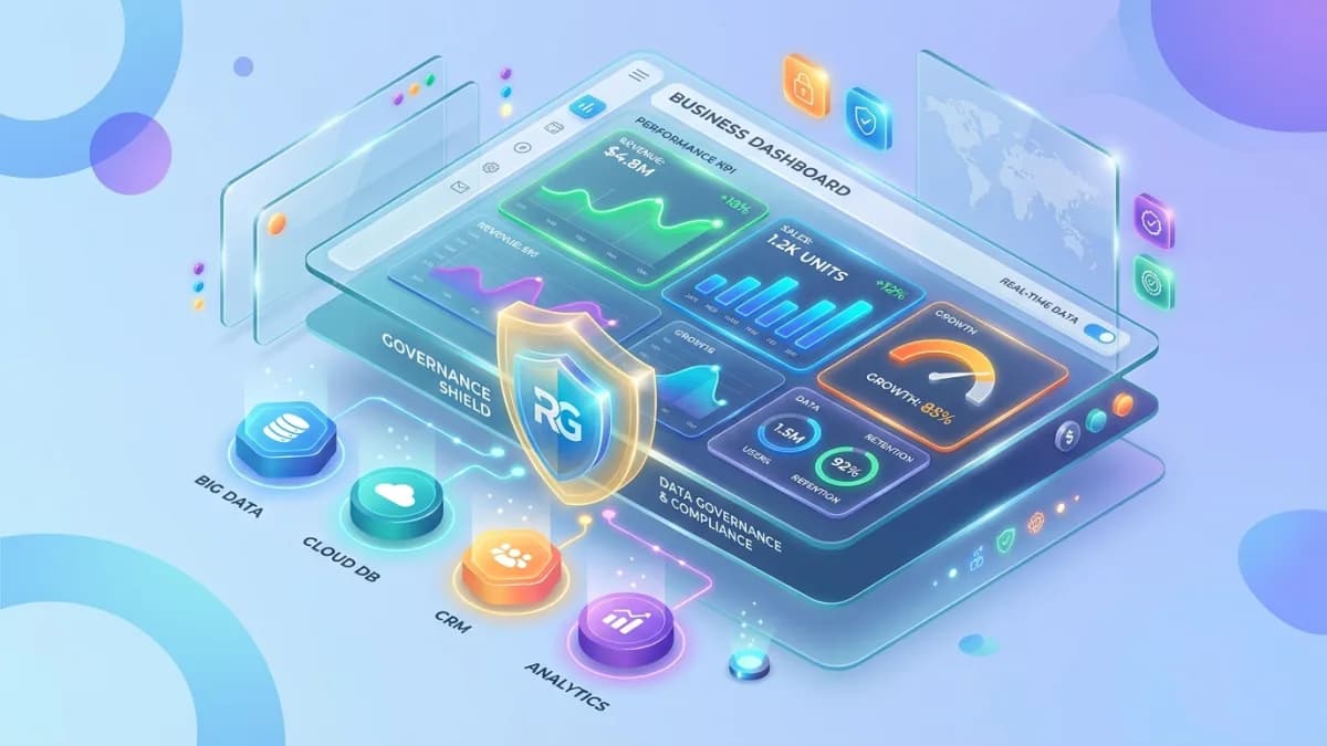
A business dashboard is only useful if people trust it. Pretty charts do not matter when the team argues about what the numbers mean, where the data came from, why yesterday changed, or whether the dashboard is showing the truth.
The best dashboards reduce confusion. They show the right KPIs, from the right sources, at the right level of detail, with clear definitions and owners. The worst dashboards become decorative noise: impressive in meetings, ignored in decisions.
Dashboard design is not just visual design. It is business governance.
This guide explains how to design dashboards that small businesses, agencies, service companies, e-commerce teams and operations managers can actually use. It covers KPI selection, metric definitions, data sources, refresh cadence, permissions, quality checks, dashboard layout, adoption and governance.
Use this with the Small-Business Automation Guide, CRM Implementation Guide, Lead Management Automation Guide, SEO Reporting Dashboard Guide, and Business Automation & Integrations.
Key Takeaways
- A dashboard should answer a business question, not simply display available data.
- KPI definitions must be documented before charts are built.
- Every dashboard needs a source of truth, refresh cadence, owner and quality checks.
- Different users need different views: executive, sales, marketing, operations, finance and support.
- GA4 event parameters and custom dimensions can improve reporting, but unnecessary high-cardinality dimensions should be avoided.
- Looker Studio and similar tools rely on data sources as the model connecting reports to external systems.
- Access control matters because dashboards can expose customer, revenue and operational data.
- A trusted dashboard is maintained like a product, not abandoned after launch.
What Business Dashboard Design Means
Business dashboard design is the process of turning data into a decision interface.
It includes:
- choosing business questions
- selecting KPIs
- defining metrics
- identifying data sources
- cleaning data
- connecting systems
- designing visual layout
- setting permissions
- documenting ownership
- maintaining trust
The dashboard should make it easier to answer questions such as:
- Are leads increasing?
- Are leads becoming qualified opportunities?
- Which source creates revenue?
- Are projects delayed?
- Is support volume rising?
- Are invoices being paid on time?
- Are website conversions improving?
- Which team needs attention?
If a dashboard does not support a decision, it is probably a report-shaped ornament.
Start With Decisions
Before charts, ask:
- Who will use the dashboard?
- What decisions will they make?
- How often will they review it?
- What action should happen when a number changes?
- What is the acceptable data delay?
- Which numbers must be trusted?
Examples:
| User | Decision |
|---|---|
| Owner | Where should we invest next month? |
| Sales manager | Which leads need follow-up today? |
| Marketing manager | Which channels create qualified leads? |
| Operations manager | Which projects are blocked? |
| Finance | Which invoices need collection? |
| Support lead | Which issue category is growing? |
The more specific the decision, the better the dashboard.
Choose KPIs Carefully
KPIs are key performance indicators, not every number available.
Good KPIs are:
- tied to business goals
- clearly defined
- measurable
- owned
- reviewed regularly
- actionable
Examples by area:
Sales and leads
- new leads
- qualified leads
- response time
- proposal rate
- win rate
- pipeline value
- revenue by source
Marketing
- organic clicks
- conversion rate
- cost per lead
- qualified lead rate
- channel revenue
- landing page performance
Operations
- projects on time
- blocked tasks
- onboarding completion
- delivery cycle time
- capacity utilization
Finance
- invoices sent
- paid invoices
- overdue invoices
- monthly recurring revenue
- average payment delay
Support
- first response time
- resolution time
- ticket volume
- escalation rate
- customer satisfaction
- repeated issues
Avoid KPI overload. When everything is key, nothing is.
Define Metrics Before Charts
Metric definitions prevent arguments.
For each KPI, document:
- name
- definition
- formula
- source system
- filters
- date logic
- owner
- refresh frequency
- known limitations
Example:
| KPI | Definition |
|---|---|
| Qualified lead rate | Qualified leads divided by total new leads for selected period |
| Lead response time | Time between form submission and first logged human response |
| Project on-time rate | Projects completed by agreed delivery date divided by completed projects |
| Overdue invoice value | Total unpaid invoice value past due date |
GA4 event parameters add context to user actions, and custom dimensions/metrics can make that data reportable. But Google warns against unnecessary high-cardinality custom dimensions. For dashboards, the lesson is simple: track what helps decisions, not every unique identifier you can imagine.
Data Sources and Source of Truth
Dashboards are only as reliable as their data sources.
Common sources:
- CRM
- website analytics
- Google Search Console
- accounting system
- payment gateway
- e-commerce platform
- project management tool
- support desk
- spreadsheets
- database
- call tracking
- email marketing platform
Looker Studio describes data sources as the connection and model between external systems and reports. That model matters because field types, calculated fields and data definitions shape what a dashboard can show.
Source of truth
Define one source of truth per data type.
Examples:
| Data | Source of truth |
|---|---|
| Lead owner | CRM |
| Payment status | Accounting or payment gateway |
| Organic clicks | Search Console |
| Website behavior | GA4 |
| Ticket status | Helpdesk |
| Project status | Project management tool |
If two systems disagree, the dashboard should not quietly blend the confusion.
Dashboard Types
Different dashboards serve different users.
Executive dashboard
Shows:
- revenue
- pipeline
- qualified leads
- conversion rate
- cash collection
- major operational risks
Keep it high-level and decision-oriented.
Sales dashboard
Shows:
- new leads
- follow-up tasks
- response time
- pipeline by stage
- stuck deals
- proposals sent
- win/loss reasons
This should help sales act today.
Marketing dashboard
Shows:
- traffic by channel
- conversions
- cost per lead
- qualified leads by source
- landing page performance
- SEO visibility
Connect marketing to quality, not only volume.
Operations dashboard
Shows:
- active projects
- blockers
- capacity
- overdue tasks
- onboarding status
- delivery risks
This should reveal what needs intervention.
Layout and UX
Dashboard layout should guide the eye.
Rules:
- most important KPIs at top
- group related metrics
- use consistent date ranges
- label charts clearly
- show comparisons only when useful
- avoid too many colors
- include definitions or tooltips
- show last refresh time
- make filters obvious
- avoid tiny unreadable charts
Use tables when exact values matter. Use charts when trend or comparison matters.
The dashboard should tell a story:
- 1What is happening?
- 2Is it good or bad?
- 3Why might it be happening?
- 4What should we do next?
Data Quality Checks
Build trust with checks.
Check:
- missing fields
- duplicate records
- broken integrations
- date mismatches
- currency mismatch
- timezone issues
- tracking gaps
- unusual spikes
- source totals vs dashboard totals
- stale data
Add a data quality section if needed:
- last refresh
- records missing owner
- leads missing source
- invoices missing due date
- tickets missing category
This is not glamorous, but it is where trust is born. Tiny little trust goblins love clean definitions.
Permissions and Governance
Dashboards may expose sensitive data.
Govern:
- who can view
- who can edit
- who can export
- who owns each KPI
- who approves formula changes
- who handles data issues
- how access is removed
- how often dashboard is reviewed
NIST CSF 2.0 added Govern as a core function to make roles, responsibilities and risk management more visible. Dashboard governance follows the same idea: if nobody owns definitions, access and quality, dashboard trust becomes accidental.
Dashboard Maintenance
Dashboards decay when businesses change.
Review monthly or quarterly:
- KPI relevance
- broken connectors
- field changes
- renamed pipeline stages
- new services
- old filters
- user access
- unused pages
- stakeholder feedback
- actionability
Retire dashboards nobody uses. A smaller trusted dashboard beats a sprawling museum of forgotten charts.
Dashboard Adoption
A dashboard succeeds only when it becomes part of the operating rhythm.
Use it in:
- weekly sales reviews
- monthly marketing reviews
- project status meetings
- finance follow-up
- support retrospectives
- quarterly planning
Assign one owner to explain the numbers and one owner to fix data issues. If dashboard problems are discussed but never repaired, people slowly stop believing the reporting.
Implementation Roadmap
Phase 1: Questions
List decisions and users.
Phase 2: KPIs
Choose the few metrics that answer those decisions.
Phase 3: Definitions
Document formulas, filters, owners and sources.
Phase 4: Data audit
Check whether source data is clean enough.
Phase 5: Prototype
Build a simple dashboard with sample users.
Phase 6: Validate
Compare numbers against source systems.
Phase 7: Launch
Train users and document definitions.
Phase 8: Maintain
Review usage, trust and changes regularly.
100-Point Dashboard Readiness Score
| Area | Points | What 100 percent work looks like |
|---|---|---|
| Decision clarity | 15 | Dashboard users and decisions are documented |
| KPI selection | 15 | Metrics are few, meaningful and actionable |
| Definitions | 15 | Formulas, filters, date rules and owners are documented |
| Data sources | 10 | Systems of record are mapped |
| Data quality | 10 | Missing, duplicate, stale and mismatched data checks exist |
| Layout/UX | 10 | Dashboard is readable, grouped and easy to filter |
| Access control | 10 | View, edit and export permissions are governed |
| Maintenance | 5 | Review cadence and owner are assigned |
| Training | 5 | Users understand meanings and limits |
| Action process | 5 | Team knows what to do when KPIs change |
Score interpretation
- 90 to 100: Ready for launch.
- 75 to 89: Good, but fix definitions or data quality first.
- 50 to 74: Prototype only.
- Below 50: Do not build yet; clarify decisions and sources.
Frequently Asked Questions
What is business dashboard design?
Business dashboard design is the process of turning trusted data into a visual reporting tool that helps owners and teams make decisions.
What KPIs should a small business dashboard include?
Start with leads, qualified leads, conversion rate, revenue, pipeline, overdue invoices, project status, support volume and any operational metric tied to current decisions.
Why do dashboards fail?
Dashboards fail when metrics are undefined, data sources are untrusted, too many charts are included, permissions are unclear or nobody uses the dashboard for decisions.
How often should dashboards refresh?
Refresh cadence depends on use. Daily may be enough for management dashboards, while sales or support dashboards may need near-real-time updates.
Should dashboards include every metric?
No. A dashboard should focus on metrics that support decisions. Keep deep analysis in separate reports.
Final Recommendation
Design dashboards like decision systems.
Start with the decision, define the KPI, confirm the source of truth, validate the data, control access and maintain the dashboard over time. A trusted dashboard helps the business act sooner, argue less and improve with evidence.
Before development, document which decision each dashboard supports, who owns every metric, and what action should happen when a number changes. That extra clarity prevents decorative reporting and keeps the dashboard tied to daily operations. It also gives future team members enough context to maintain the dashboard without guessing why each chart exists.
If you need CRM, website analytics, sales, support, project or finance systems connected so a dashboard has reliable data, see Business Automation & Integrations.
Related posts

Google Consent Mode v2 and Cookie Consent: A Setup Guide for Business Sites
How to set up Google Consent Mode v2 alongside a compliant cookie banner: ePrivacy and PECR consent rules, the GDPR consent standard, the four consent parameters, basic versus advanced mode, CMP requirements, WordPress and Shopify implementation, Tag Assistant testing and common mistakes.
Read article →

US State Privacy Laws for Small Business Websites: What Applies and What to Do
A practical 2026 guide to US state privacy laws for small business websites: CCPA/CPRA thresholds, the other comprehensive state laws, Texas and Nebraska small-business rules, privacy notices, opt-out of sale and sharing, Global Privacy Control, pixels, forms, vendor contracts and CAN-SPAM.
Read article →

Store Blog Publishing Schedule Guide for SEO Growth
A practical guide to scheduling store blog posts so publishing stays consistent without becoming random.
Read article →
Author
Anushka Dahanayake
Anushka Dahanayake builds SEO-focused websites, e-commerce platforms, dashboards, and automation systems for businesses worldwide.