
Case Study: Optimizing a WooCommerce Checkout to Reduce Cart Abandonment by 28%
A metric-driven analysis of how we optimized WooCommerce checkouts to reduce cart abandonment, speed up checkouts, and increase conversions.
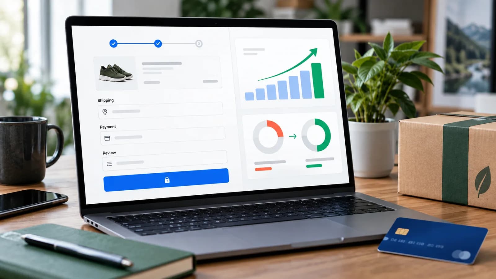
When scaling an online store, minor checkout friction can impact conversions. For WooCommerce sites, default checkout flows often feature long multi-step fields, layout shifts, and slow database queries that cause visitors to abandon their carts.
In this case study, we document the workflow and optimizations implemented for a high-volume B2B e-commerce store that reduced cart abandonment rates by 28% and increased revenue by 14%.
This is an illustrative case study built from a representative optimization project, not a named client engagement; figures show the type of improvement this approach can produce, not a guaranteed or audited result for any specific store.
1. Project Background and Core Metrics
Our client operated a wholesale parts store built on WooCommerce. The checkout page took over 3.2 seconds to load, and the form featured 18 input fields, including mandatory billing/shipping sections.
Key Metrics Before Optimization:
- Cart Abandonment Rate: 74%
- Checkout Load Time: 3.2 seconds
- Mobile Conversion Rate: 1.8%
2. The Optimization Strategy
We restructured the checkout flow by focusing on speed, layout design, and friction reduction.
A. Implementing a Single-Page AJAX Checkout
The store's heavily customised theme had split cart review and checkout across several page loads. We rebuilt it as one page where quantities, coupons and details update via AJAX without full reloads. On the classic checkout, the simplest reliable way to recalculate totals after a custom change is to ask WooCommerce to do it:
`javascript
// Let WooCommerce's own checkout script recalculate totals and shipping
jQuery(document.body).on('change', 'input.qty', function () {
jQuery(document.body).trigger('update_checkout');
});
`
Stores on the block-based Checkout (the default for new WooCommerce installs) get this behaviour built in; customise them through block settings and the Store API rather than jQuery.
B. Field Optimization
We streamlined checkout forms by hiding non-essential fields (e.g. second address line, company details, county inputs) for retail buyers, reducing input fields from 18 to 7.
C. Server Response and Query Optimization
We added database indexing to WooCommerce query tables, configured Redis Object Cache, and set up LiteSpeed page caching to bypass database lookup loops.
3. Before and After Performance Metrics
Rebuilding the checkout flow and optimizing site speed led to the following improvements:
| Metric | Day 1 | Day 60 | Improvement |
|---|---|---|---|
| Checkout Page Load Time | 3.2 seconds | 0.7 seconds | -78% faster load time |
| Cart Abandonment Rate | 74% | 53.2% | -28% lower abandonment |
| Checkout Completion Rate | 26% | 46.8% | +80% higher completion |
| Average Order Value (AOV) | $120 | $136 | +13.3% higher average value |
4. How We Diagnosed Checkout Friction
Before changing the checkout page, we reviewed analytics, session recordings, speed reports, payment logs, and WooCommerce order notes. The biggest issue was not one single bug. It was a stack of small problems: slow mobile loading, too many fields, shipping recalculation delays, coupon confusion, layout shifts, and unclear payment errors.
The store was receiving enough traffic, but too many customers reached the checkout and stopped. That meant the business did not need more advertising first. It needed to recover revenue already sitting inside the funnel.
We grouped the diagnosis into four areas:
- Speed: page load time, AJAX response time, database queries, and payment gateway delay.
- Clarity: field labels, shipping costs, taxes, coupon behavior, and error messages.
- Trust: payment badges, return policy, support availability, and secure checkout messaging.
- Measurement: GA4 events, cart abandonment data, and checkout step tracking.
This structure kept the project practical. Instead of redesigning the whole store, we focused on the moments where customers were leaving.
5. Mobile Checkout Improvements
Most checkout sessions came from mobile users, so the mobile layout received special attention. We increased tap target spacing, moved payment methods higher, reduced unnecessary fields, fixed sticky elements that covered the order total, and ensured validation messages appeared next to the relevant field.
Mobile checkout should feel short and predictable. Customers should always know what is required, what they are paying, and what happens next. If the page jumps when shipping recalculates or an error message appears, users lose confidence quickly.
For WooCommerce stores, common mobile fixes include:
- Use one column for checkout fields.
- Keep labels visible rather than relying only on placeholders.
- Avoid large banners inside checkout.
- Show order summary clearly without taking over the screen.
- Display payment errors in plain language.
- Keep coupon fields available but visually secondary.
6. Payment Gateway and Error Handling
Checkout optimization is not complete until payment failures are reviewed. Some abandonment happens because the customer changed their mind. Some happens because the payment gateway returned unclear errors, the site timed out, or a plugin conflict interrupted the order.
We reviewed failed order notes and gateway logs to identify recurring problems. Then we improved timeout handling, reduced plugin conflicts, and made error messages more useful. A customer should know whether their card failed, a required field is missing, shipping cannot be calculated, or the payment gateway is temporarily unavailable.
For international stores, payment options also matter. A store selling to the USA, UK, Europe, Canada, and Australia may need card payments, PayPal, Apple Pay, Google Pay, local wallets, or buy-now-pay-later options depending on audience. More options are not always better, but the right options reduce hesitation. For card payments from EU/EEA and UK customers, the gateway must also handle Strong Customer Authentication under PSD2 (normally 3-D Secure 2). Test the challenge flow on mobile, because a 3-D Secure step that fails or confuses buyers looks like abandonment in the data.
7. Trust Signals That Help Without Clutter
The checkout page is not a marketing landing page. It should be focused, fast, and trustworthy. We added concise trust elements near the payment area: secure payment note, accepted payment icons, delivery/return summary, and support contact availability. We avoided large testimonials or promotional blocks that distracted from completing the order.
Useful checkout trust signals include:
- Secure payment message.
- Clear return or exchange policy link.
- Shipping time estimate.
- Support email or live chat availability.
- Payment method icons.
- Privacy reassurance near personal details.
The key is restraint. Trust elements should answer doubts without making the checkout page feel noisy.
8. Analytics Events Used in the Case Study
The store needed clean measurement before and after optimization. We tracked view cart, begin checkout, add shipping info, add payment info, purchase, coupon applied, payment error, shipping error, and checkout field validation errors.
GA4 revenue tracking was tested against WooCommerce orders to ensure reported revenue matched real transactions. Without that validation, the store could make decisions from broken analytics.
Important checkout KPIs included:
- Cart abandonment rate.
- Checkout completion rate.
- Payment failure rate.
- Mobile conversion rate.
- Average order value.
- Revenue per visitor.
- Checkout load time.
- Coupon usage rate.
This connects directly with checkout optimization, conversion rate optimization, and WooCommerce store setup.
9. 100-Point Checkout Optimization Score
| Area | Points |
|---|---|
| Mobile checkout is clear and fast | 15 |
| Required fields are reduced | 15 |
| Payment errors are understandable | 15 |
| Shipping/tax calculation is stable | 10 |
| GA4 events match WooCommerce orders | 10 |
| Layout shift is controlled | 10 |
| Trust signals are present but restrained | 10 |
| Plugin conflicts are reviewed | 10 |
| Follow-up cart recovery is configured | 5 |
Stores under 75 usually have obvious revenue leaks. Stores above 90 tend to have fewer distractions, better payment reliability, and cleaner tracking.
10. What We Would Test Next
Checkout optimization does not end after one release. The next testing ideas included express payment buttons, address autocomplete, saved customer accounts, delivery estimate placement, free-shipping threshold messaging, and improved abandoned cart email timing.
Each test should have a hypothesis. For example, "showing express payment above the form will improve mobile checkout completion for returning customers." Without a hypothesis, testing becomes random design changes.
11. Abandoned Cart Recovery After Checkout Fixes
After the checkout became faster and clearer, abandoned cart recovery became more effective. Recovery emails and reminders work better when the checkout itself is trustworthy. If the page is still broken, email reminders simply send shoppers back to the same frustrating experience.
We separated recovery messages by intent. A customer who abandoned after viewing shipping costs received a different message from a customer who failed payment. A returning customer with an account received a shorter reminder than a first-time visitor. This made the recovery workflow feel more relevant.
For WooCommerce, recovery campaigns should respect consent rules, avoid excessive reminders, and stop immediately after purchase. The goal is to help interested shoppers complete an order, not pressure people who clearly moved on.
12. Maintenance After the Case Study
Checkout quality can decline after plugin updates, theme changes, payment gateway updates, or hosting changes. We added a monthly review process covering payment logs, failed orders, checkout speed, mobile layout, and analytics accuracy.
This maintenance step is important because WooCommerce stores evolve. New plugins, sales campaigns, shipping zones, coupons, and payment methods can introduce friction. A checkout that performs well today still needs regular review.
13. Prelaunch Checkout QA Checklist
Before a checkout redesign goes live, test it like a customer and like a store owner. Place test orders on desktop and mobile. Try guest checkout, logged-in checkout, coupon codes, failed card payments, shipping address changes, tax calculations, out-of-stock products, and order emails.
The store owner should also confirm the admin side: order notes, payment capture, stock reduction, invoice emails, refund flow, abandoned cart tracking, and analytics events. A checkout can look perfect on the front end while silently breaking operations in the back office.
14. SEO and Checkout Optimization Work Together
SEO brings visitors to category pages, product pages, and buying guides. Checkout optimization converts those visitors into revenue. Treating these as separate projects is a mistake. If organic traffic grows but checkout is slow, the business pays for content and technical SEO without receiving the full return.
For WooCommerce stores, the best growth plan usually connects product page SEO, category page SEO, speed optimization, and checkout improvement. That creates a complete path from search impression to purchase.
15. When to Rebuild Instead of Patch
Sometimes checkout problems come from one plugin conflict or a few poor settings. Other times the store has too many plugins, a heavy theme, outdated payment extensions, and years of database clutter. In those cases, rebuilding the checkout flow or redesigning the store architecture may be more cost-effective than endless small patches.
The decision should be based on evidence: error logs, performance data, plugin review, conversion metrics, and maintenance cost.
Frequently Asked Questions
Is one-page checkout always better for WooCommerce?
Not always. One-page checkout works well when the form is short and fast. For complex B2B orders, a structured multi-step flow may be clearer. The best choice depends on products, shipping rules, and customer behavior.
How much can checkout optimization improve revenue?
Results vary, but stores with slow checkout, payment errors, or excessive fields can often recover meaningful revenue without increasing traffic. The case study improved abandonment by 28% and revenue by 14%.
Should checkout pages have lots of design elements?
No. Checkout should be focused. Add only the trust and clarity elements that help customers complete the purchase.
What should be measured before changing checkout?
Measure checkout completion, payment failures, load time, mobile conversion, cart abandonment, revenue per visitor, and GA4 purchase accuracy.
Final Recommendation
Optimizing a WooCommerce checkout is one of the highest-leverage e-commerce improvements because it improves revenue from existing traffic. Start with speed, field reduction, payment reliability, mobile usability, and clean analytics before spending more on ads.
Related posts

Shared vs VPS vs Managed Hosting for a Small Business Website or Store
A plain comparison of shared hosting, VPS and managed hosting or PaaS for small business sites and online stores: responsibilities, isolation and performance, the signs a WooCommerce store or Next.js app has outgrown shared hosting, GDPR data residency, and a decision table.
Read article →

Passkeys and MFA for Small Teams: What to Choose and How to Roll It Out
A practical guide to multi-factor authentication for small businesses: SMS codes vs authenticator apps vs passkeys and security keys, which accounts to protect first, how to avoid lockouts with recovery codes and backup methods, and a phased rollout plan for a small team.
Read article →
Shopify vs WooCommerce Checkout Comparison
A practical checkout comparison for store owners choosing between Shopify and WooCommerce.
Read article →
Author
Anushka Dahanayake
Anushka Dahanayake builds SEO-focused websites, e-commerce platforms, dashboards, and automation systems for businesses worldwide.